Sales Tracker Dasboard
Sector:
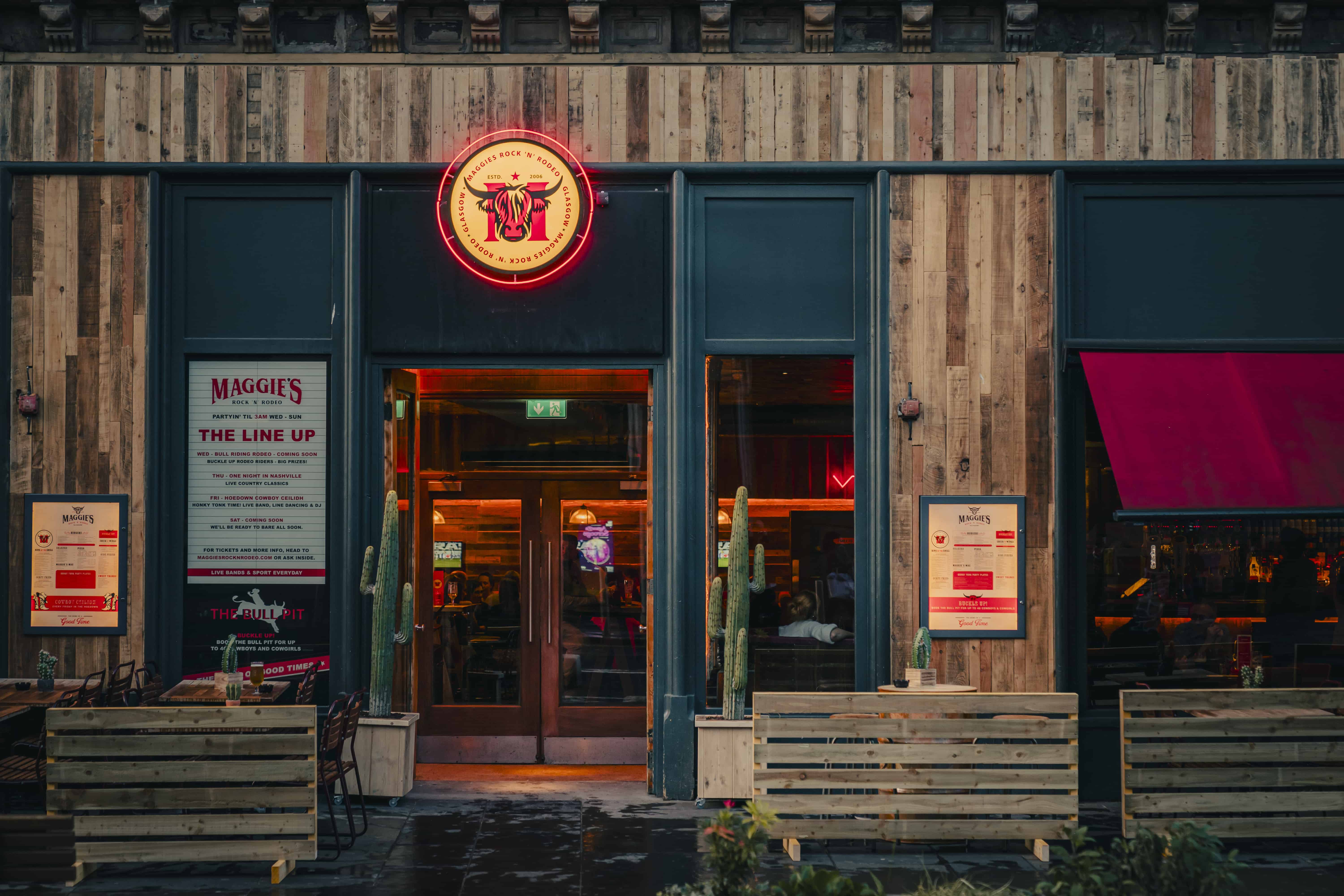
Hospitality
Role:
Lead Designer

The Challenge
The Solution
Research & Team Collaboration
Defining Key Metrics & Structuring the Data Source
Defining Key Metrics & Structuring the Data Source
The dashboard itself was divided into three core sections to reflect the most relevant performance areas:
Tickets Sold vs Left Over
Revenue MtM
Total Ticket + Package Sales
Each section gave the team a clear, segmented view of sales and attendance data. I also included interactive filters to allow users to explore the data in more depth—filtering by individual venues, events, and spaces.
Visual Design & User Experience
To make the data as accessible as possible, I used line graphs and simplified visual elements that made trends easy to spot at a glance. For example the line graphs showing monthly sales helped the team quickly see performance patterns across the year. The final dashboard gave users a clear, user-friendly interface that made key insights immediately available.
Improved Access & Team Enablement
Backdated Data & Ongoing Reporting
Although the dashboard was developed in Q4 of 2024, I retroactively compiled and inputted data from Q1-Q3 to provide a completed year to date picture. At the start of Q1 2025, I saved and distributed PDF summaries of each dashboard view to the wider team, offering a high level performance overview for each venue, event, and space. This made it easier to communicate key trends for the year, highlight high and low performers, and provide the team with actionable insights for future planning.
Final Result: Ticket Sales Increase
The dashboard also enabled deeper insights into event-specific performance across different time periods. For example, Sloans hosts an event called "EatFilm" where every Tuesday they play a different movie with a meal included in the price of a ticket. Using this dashboard I was able to show the team the data that represented seasonal trends. The most notable trends being that romantic comedies consistently performed best in the winter months, and that musicals proved most popular during spring and early summer.
Using this data, the team adjusted their schedule for 2025, moving the majority of musicals to May. As a result the bookings team saw an increase in ticket sales by 15% on average. With some individual film sales improving by almost 50% from their performance in 2024.